


Expect the Unexpected
25th of January, Stockholm
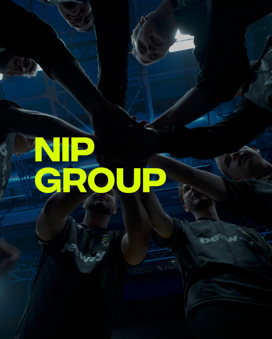
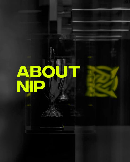
The legendary esports organisation Ninjas in Pyjamas (NIP) today announces its rebrand. After 20 years of existence, NIP states that a rebrand is crucial to the company's continued development and its purpose: to create transformational experiences that entertain, inspire, develop and connect fans all over the world.
Founded in 2000, NIP has for over two decades been considered one of the most influential professional esports organisations in the world, most notably known for its history in the game of Counter-Strike - where NIP’s first roster in CS:GO dominated in the game’s early stages back in 2013. Today, the global organization boasts world-class teams and players in four different games: CS:GO, Rainbow Six, VALORANT and FIFA.
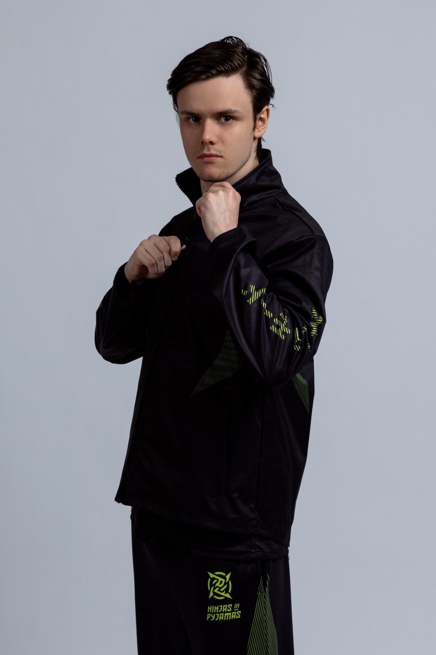
The rebrand not only consists of a completely new visual design where the old logotype, the Shuriken (a weapon used by Ninjas) is modernized and the previous team colors (black/gold/white) are replaced, it also includes a deeper and more exciting narrative where NIP has taken inspiration from traditional ancient Japanese emblems and Katakana (a Japanese writing character).
“For us who work at and play for NIP, being a Ninja is something special, it’s more than just a brand and we kept that in mind while creating this new narrative to deliver an unforgettable experience for our fans and partners all over the world. Ninjas fight as one, we have discipline, we stay calm and we inspire. A ninja can be everyone and we feel it’s important to create a story that anyone can connect with,” says Hicham Chahine, CEO at NIP
Chahine reveals that Ninjas in Pyjamas has been working on this new rebrand for over a year, making sure that the brand experience is delivered to its utmost potential. The Swedish company has put a lot of effort into it, using several agencies for research and insights, e-commerce and to create a visual design and a storyline that will live on for years to come. Everything is carefully planned and thought through, even the new logotype consists of meaningful details.
“We are very proud of the new logotype and it is a huge step forward in terms of visual identity. Inside of the new Shuriken, is the old Japanese word Nin, which is the beginning of Ninja and means to apply ego and heart to the edge of the sword. We believe that intricate details like these are crucial to showcase and supply our fans with.” says William Bui, Brand Manager at NIP.
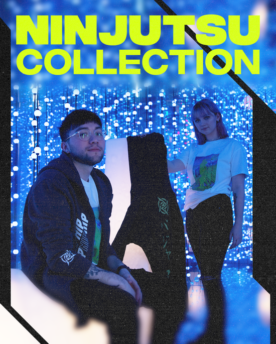
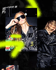
For all the fans cheering for NIP, this rebrand also includes new collections of clothes and other merch, designed to embody the feeling and values of being a Ninja. With inspiration gathered from Tokyo drifters to Norens, the new colors - neon, yellow, black and grey - are all carefully selected and symbolize a futuristic, powerful and mysterious brand. To meet the fans’ needs, a new digital platform to emulate the speed, the precision and the eloquence of the new brand is in place.
Ninjas in Pyjamas legacy stretches as far as 20 years back in time with achievements and they are determined to continue building a lasting legacy.